What Your Desk Says About You: The Hidden Language of Color in Office Supplies
You probably didn't agonize over it. Maybe you grabbed the teal notebook because it looked nice on the shelf, or you defaulted to black because it felt serious. But here's the thing: color choices in your workspace aren't as random as they seem. Research in environmental psychology suggests that the colors surrounding us during work hours have a measurable effect on focus, creativity, stress levels, and even how others perceive our competence.
When it comes to paper goods and stationery, most people think about function first—line spacing, paper weight, cover durability. But the color of that cover? It's doing more work than you'd expect.
The Science Is Simpler Than You Think
Color psychology doesn't require a PhD to apply. At its core, the field examines how different hues trigger emotional and cognitive responses. These responses are partly cultural and partly neurological. In the US workplace context, certain color associations have become fairly consistent across industries.
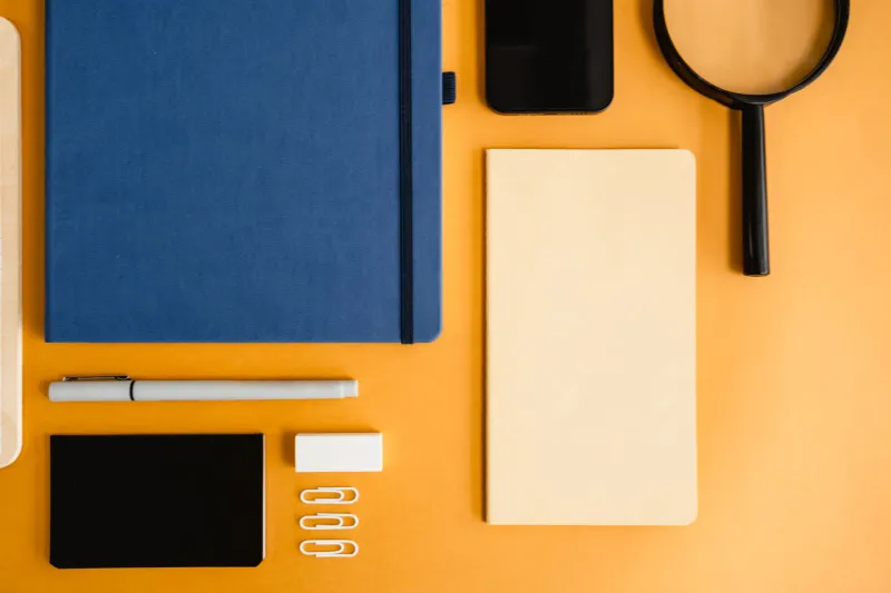
Blue, for instance, is widely associated with calm, reliability, and focus. It's no accident that so many corporate brands lean on navy or cobalt. Studies have found that people working in blue-toned environments tend to produce more detail-oriented work. If your go-to notebook is a deep navy hardcover, you might be signaling—consciously or not—that you're methodical and dependable.
Green sits in a sweet spot between calm and stimulation. It's easy on the eyes (literally—the human eye requires the least adjustment to process green wavelengths), which makes it a strong choice for long writing sessions or brainstorming marathons. Creative professionals who work in green-accented spaces or reach for sage and forest-toned journals often report feeling less fatigued during extended work periods.
Yellow is trickier. It's energizing and optimism-inducing in small doses, but overwhelming in large quantities. A yellow legal pad or sticky note stack? Great. An entirely yellow desk setup? That's a recipe for distraction. Yellow works best as an accent—a pop of brightness in an otherwise neutral spread.
What Red and Black Are Really Communicating
Red is the most emotionally loaded color in the spectrum. It signals urgency, confidence, and intensity. In a meeting, pulling out a bold red notebook makes a statement. Research has also shown that red can increase attention to detail in short bursts, which is why it's popular for editing and review work. The downside: prolonged exposure to red in a workspace can elevate stress responses. Use it with intention.
Black, the perennial default, communicates authority and professionalism. It's safe in the best and worst sense of the word. A matte black notebook says you're serious, polished, and probably not the person who doodles in the margins. But black can also read as impersonal in collaborative environments. If you're in a creative field where personality matters, an all-black setup might actually work against you.
White and neutral tones—ivory, cream, warm gray—communicate clarity and openness. Minimalist stationery in these palettes has surged in popularity among designers and strategists who want their ideas to take center stage rather than their supplies. There's also a tactile component here: high-quality cream or ivory paper stock feels premium in a way that bright white often doesn't, and that texture communicates care and attention to craft.
Texture Is Part of the Color Story
Here's something that often gets overlooked: texture and color work together to create a complete sensory impression. A rough-textured cover in forest green reads very differently than a glossy cover in the same shade. The matte, linen-textured notebooks that have become a staple in design studios and editorial offices aren't just aesthetically pleasing—they communicate a certain intentionality. They say, this person thought about this.
Paper texture inside the notebook matters too. Smooth, bright white paper suggests precision and efficiency. Cream-toned, slightly toothy paper invites slower, more deliberate writing. For people who use their notebooks as creative thinking tools rather than task lists, that tactile quality can genuinely shift the quality of thought that goes onto the page.
Building a Color-Intentional Workspace
So how do you actually apply this? A few practical frameworks:
Match color to function. If you keep separate notebooks for different types of work—one for meeting notes, one for project planning, one for personal ideas—use color to differentiate them. Blue for operational work, green for creative brainstorming, red for review and feedback. Your brain will start to associate the color with the mode of thinking before you've even opened the cover.
Consider your audience. If your desk is visible during video calls or in-person meetings, your stationery is part of your professional presentation. A cohesive, intentional color palette communicates that you're organized and design-aware. This matters more than most people realize—especially in client-facing roles.
Don't underestimate the power of one accent color. You don't need to overhaul your entire setup. Swapping out a generic notepad for one in a color that genuinely energizes you can have a subtle but real effect on your daily mood at the desk. Small choices, made deliberately, add up.
Think about your industry's color culture. Finance and law tend to skew dark and neutral. Creative agencies often embrace color more boldly. Matching your stationery palette to your industry signals fluency in that culture's visual language—while a well-chosen deviation can signal that you're a creative thinker within a traditional field.
The Notebook You Choose Is a Design Decision
At the end of the day, your office supplies are part of your environment, and your environment shapes your thinking. That's not a soft, feel-good claim—it's backed by decades of environmental psychology research. The colors you surround yourself with during your working hours are doing quiet, constant work on your focus, your mood, and the impression you make on the people around you.
Choosing a notebook because it's the right color for the right purpose isn't overthinking it. It's the same logic that goes into choosing a well-lit office or an ergonomic chair. Intentional design choices, even small ones, have real returns. Your stationery is no exception.