Not All White Is White: A Practical Guide to Paper Color in Client Work
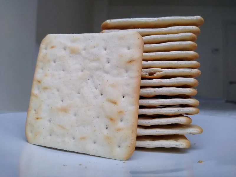
Photo: Mx. Granger, CC0, via Wikimedia Commons
Ask ten people what color the paper in their printer tray is and nine will say white. Technically they're right. Practically, they're describing a range that runs from a blue-white bright enough to hum to a warm cream that smells like a library in 1974. That range does more work than most of us give it credit for.
Paper color shapes contrast. Contrast shapes reading speed. Reading speed shapes how tired your reader is by page four. Color also nudges perception — clinical versus considered, cheap versus deliberate — and it changes how your ink looks sitting on the page. None of this is mystical. It's optics plus a little psychology, and it's all plannable in about ten minutes before you place your next order.
White Isn't a Color, It's a Range
Walk into any paper aisle in the US and you'll see three flavors of white doing very different jobs.
Bright white (92–98 brightness) is the default office ream. It's blue-leaning, it makes black toner pop, and it reads as efficient. It's great for internal memos, shipping docs, and anything designed to be skimmed and tossed. On a long document, though, that much glare is genuinely tiring. Ninety-eight brightness is a lot of light bouncing back at a tired pair of eyes at 4:40 p.m.
Natural or warm white (84–90 brightness) keeps a faint yellow undertone. It's the sweet spot for anything longer than three pages — reports, white papers, pitch decks printed for a room. Warmth knocks down glare, which is why so many books are printed on stock that looks slightly off-white next to a sheet of copy paper.
Cream or ivory goes a step further. It reads softer, older, more expensive. There's a reason formal invitations and letterpress shops default to it: cream flatters ink, especially black ink, and makes a page feel like an object rather than a printout.
The Case for Cream (and When It Backfires)
Cream is the easiest upgrade in stationery. Slap a proposal interior on a 28 lb cream text sheet and suddenly the whole package reads as intentional. Résumés on cream are memorable in a stack of twenty-five identical white sheets — assuming you're handing it to a human. Feed that same résumé into an applicant tracking system and it scans fine, but if anyone prints it later for an interview packet, the color stops matching the rest of the folder.
Where cream backfires: dense tables, charts with lots of pale fills, and anything reproduced on a cheap office copier. A warm sheet plus a warm ink equals mush. If your document leans visual, give cream a pass and let the graphics carry the weight on a neutral white.
Gray Is the Underrated One
Gray gets ignored, which is a shame, because it solves a specific problem beautifully: making a piece of paper look designed without looking themed. A light gray or cool stone sheet reads modern and quiet. It's forgiving to photography, it hides fingerprints, and it makes a simple black typeface look like a deliberate choice.
Use gray for creative portfolios, lookbooks, one-sheet leave-behinds, and anything a client might pin to a wall. Avoid it for contracts and legal-adjacent paperwork — light gray plus a photocopier is a contrast gamble you don't need to take.
A Quick Guide by Document Type
- Client proposals: warm white or cream interior, bright white cover if you're printing in-house. Interior color does the reading; cover does the impression.
- Résumés: bright white if you're applying through a portal, cream or natural if you're hand-delivering. Pick one and stay consistent across your whole search.
- Creative portfolios: gray or natural white, heavier weight. The paper is part of the portfolio — treat it as a design element, not a container.
- Internal documents: plain bright white, 20–24 lb. Nobody has ever been moved by an internal status report, and that's fine.
- Client-facing invoices and statements: bright white, uncoated. You want clarity and no ambiguity about numbers.
- Notes and working drafts: whatever's cheapest, honestly. This is where you should not be precious.
The Ink Variable Nobody Budgets For
Paper color and ink color negotiate with each other. Black ink on bright white is maximum contrast — crisp, slightly hard. Black on cream is softer, more editorial, easier to read for long stretches. Navy ink on gray looks rich; navy on cream can go muddy. If you're printing in color, remember that any tinted sheet shifts every color on it. Proof one sheet before you commit to five hundred.
One more: gel and rollerball inks behave differently than toner. A warm cream sheet under a fine black gel pen looks great. The same sheet under a laser printer's toner can look slightly dusty. Print a test page, hold it at arm's length, and trust your gut.
Lighting Is Half the Story
Your document will be read under something. Fluorescent office light pushes everything cooler and makes cream look dingier than it is. Warm conference-room lamps push white toward yellow. If you're prepping something for a big in-person meeting, look at your proof under the actual lights you'll be sitting under, or at minimum under a window. Five minutes with two sheets side by side will tell you more than any spec sheet.
What Color Says About Your Brand, Whether You Meant It or Not
Bright white says: efficient, operational, get to the point. Warm white says: thoughtful, established, we read our own stuff. Cream says: considered, a little traditional, possibly expensive. Gray says: modern, design-literate, quietly confident. Recycled stock with visible flecks says: we have values and we'd like you to notice.
None of those are wrong. The mistake is picking one by accident. If your brand is a scrappy five-person shop that answers emails in an hour, cream and a serif might be sending a mixed signal. If you're pitching a boutique firm on craft, bright white copy paper is quietly undercutting your argument.
The Short Version
Buy a warm white for anything someone has to actually read. Keep bright white for internal volume and forms. Use cream when you want a document to feel like a gift. Use gray when you want it to feel designed. Then print one page, hold it under the light you'll be read in, and decide with your eyes instead of the dropdown menu.